Digital transformation
Digital strategy and roadmap, system specification design, implementation oversight
Product design
User research, interactive clickable wireframes, user interface design, animations
Design & creative
Web design, branding, copywriting, content marketing, print design, 3D design, illustrations
Digital marketing
Social media management, ad-buying, advertising campaigns, SEO, PPC management
Web development
Online campaigns, WordPress landing pages, websites, promotional games
Mobile apps
Native iOS and Android development, cross-platform React Native development
Custom development
.NET, Node.js, Symfony, Laravel, Java, ReactJS, TypeScript, GraphQL, team on demand
E-commerce
PrestaShop, WooCommerce, Shopify, custom e-Shop, integrations
Strategy & growth
Strategic planning, commercial excellence, international growth, M&A support, transformation
Funding
Call mapping, proposal writing, coordination, reporting, training
Research
Market and brand analysis, consumer insights, organisational studies, sociological research
Innovation
Ecosystem development, business growth & acceleration programs, open Innovation programs
Public policy
Policy research, monitoring, evaluation & impact assessment
Economic development
Public governance, private sector & SME development, feasibility studies & analytical support
Cities & infrastructure development
Urban & territorial development, sustainable development, transport & infrastructure development, energy sector services
More services
Sustainability
Quantifying impact, ESG analytics, sustainability strategy setting, reporting & compliance
Talent as a Service
Talent recruitment, employee support, project management, contract management
Challenger Accelerator
Entrepreneurship & incubation, acceleration, open innovation
Collaboratory
In a landscape dominated by convention, we challenge the status quo. Our advisory and digital services.
Read more on our About us
Join us
If you need anything from the list to the left, give us a shout out! We provide comprehensive IT & consultancy services and are always happy to talk.
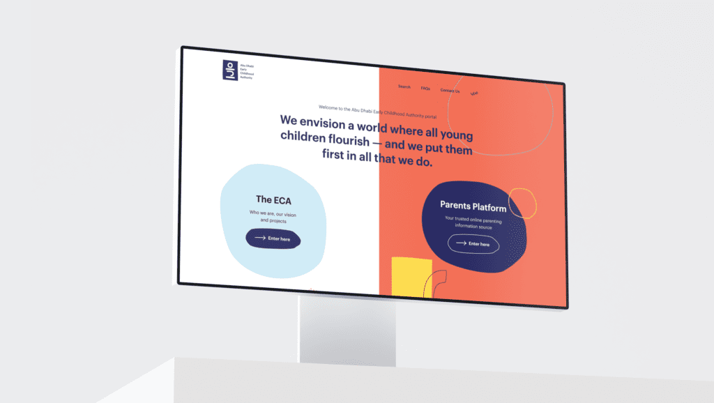
Empowering Early Childhood Development with ECA’s Digital Platform
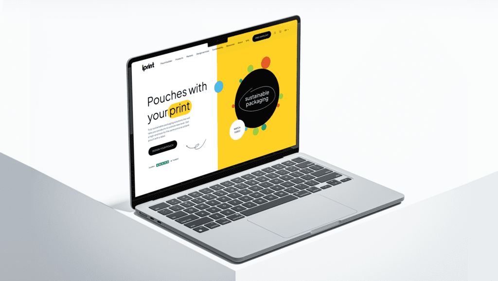
Revamping Lprint’s website to attract more customers
5G business plan development for a telecom operator
Helping Livonia Partners to build a global leader in sauna and thermally modified wood market
Civitta joins PESCO-UP project to innovate recycling mixed textiles
Extending our presence in Southern Europe
Side by side series – Manuk Hergnyan and Yeva Arevikyan