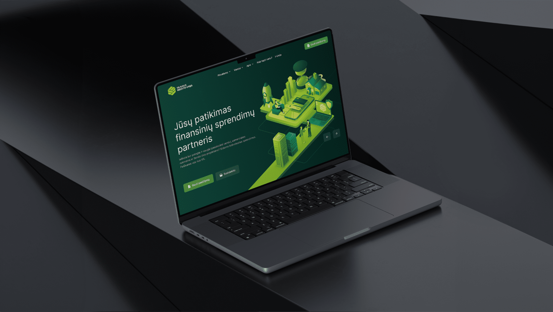
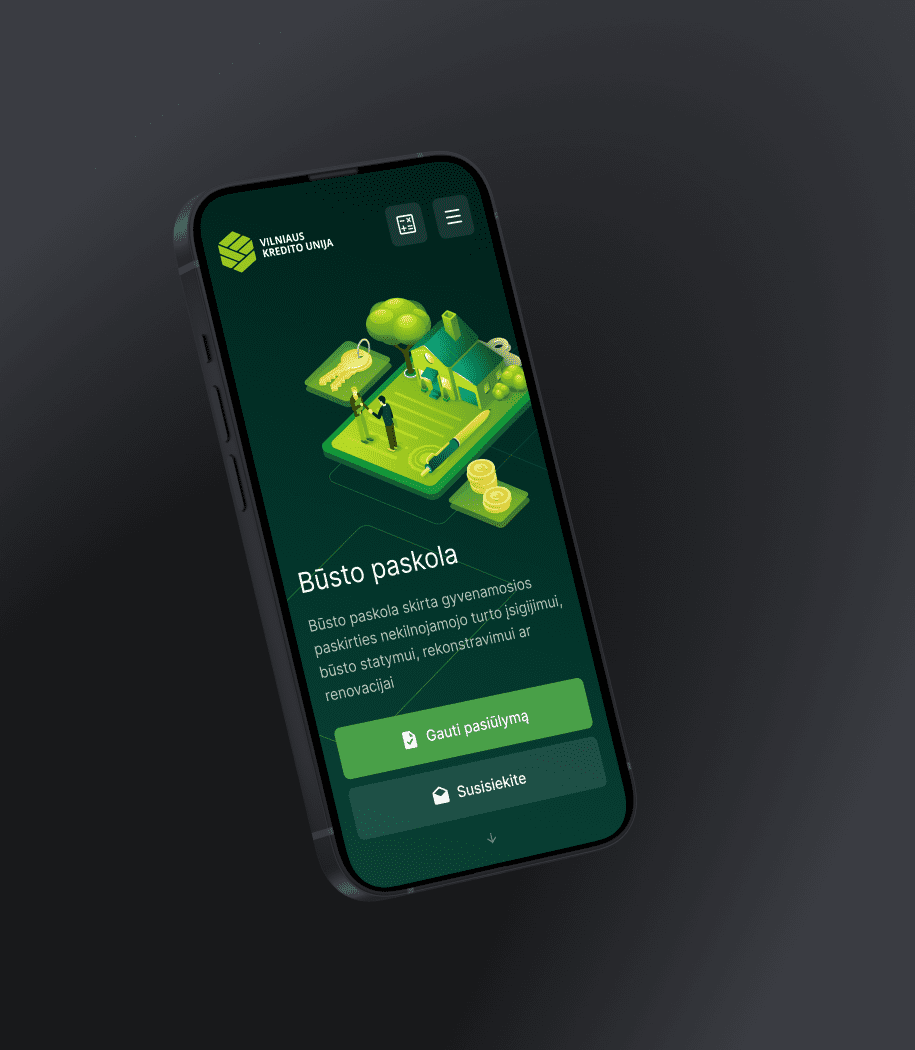
Helping to strengthen Vilniaus Kredito Unija’s (VKU) online presence
Client
Vilniaus kredito unija
The background:
Vilniaus Kredito Unija (VKU) is one of Lithuania’s longest-running credit unions, known for its commitment to offering expert financial guidance and individualized financial solutions. With many years of successful experience and a loan portfolio exceeding 43 million euros, they aimed to present themselves as one of the industry leaders.
Given that the website serves as a primary and prominent point of interaction for both existing and prospective members, our client entrusted us with the task of revamping it, as they were dissatisfied with the existing website’s structure, design, and functionality.
The essence of the project:
Our primary objective for the new website was a complete modernization of the brand, information architecture, and functionality, with the aim of appealing to a younger generation and meeting the needs of both existing and newly joined members.
To bring our vision to life, we developed a comprehensive strategic plan for the website through extensive research. We defined our key objectives and ensured alignment among all team members, including the UX designer, UI designer, illustrator, copywriter, developer, manager, and photographer.
From our initial meeting with the client, it became clear that this project was more than just creating a new website; it was about enhancing their brand by crafting a digital experience that would be memorable, distinctive, effortlessly accessible, and deeply engaging. Our primary tasks included building an intuitive information architecture, adhering to the client company’s and finance sector’s guidelines and regulations, and creating an eye-catching yet unmistakably unique design. This was quite a challenge, but in the end we managed it perfectly. And the most important thing is that the client is happy with the results.

Services provided:
- Research and information architecture: We conducted an analysis of VKU services, competitors, sitemap, definition of different user types, and our client’s current website.
- High-fidelity prototype: Our goal was to simplify navigation and improve user-friendliness.
- Design concept: We redesigned all inner pages to provide a fresh look and ensure that every click, swipe, and interaction feels natural and engaging.
- Unique illustrations and animations.
- Copywriting: We tailored it to resonate with the target audience.
- Development of the WordPress website: This involved creating the design, interactive calculators, and contact forms to make communication easier.
- VKU team photo session.
Project result:
The transformation of the VKU website has not only surpassed the performance of its predecessor but has also positioned our client ahead of the competition, strengthening their brand’s online presence and delivering tangible results in terms of performance.