Akropolis: redesigning the digital experience for the Baltics’ largest shopping centre network
Client
AkropolisClient Overview:
Akropolis is the largest shopping centre network in the Baltics, with centres in Vilnius, Kaunas, Šiauliai, Klaipėda and Riga (Akropole Rīga and Akropole Alfa). Together, they attract over 57 million visitors annually.
At that scale, the website is far more than an information page. As the first point of contact between the centres and their visitors, the website plays a central role in how people plan, navigate and experience each visit.
The Challenge:
The existing website for Akropolis worked, but it did not help visitors do the few things they came for. The most important tool, the centre map, was a flat plan that was hard to read and hard to use on mobile devices. Alongside that, the key information was spread across too many pages.
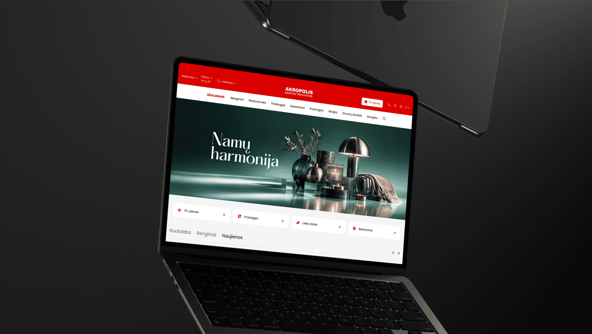
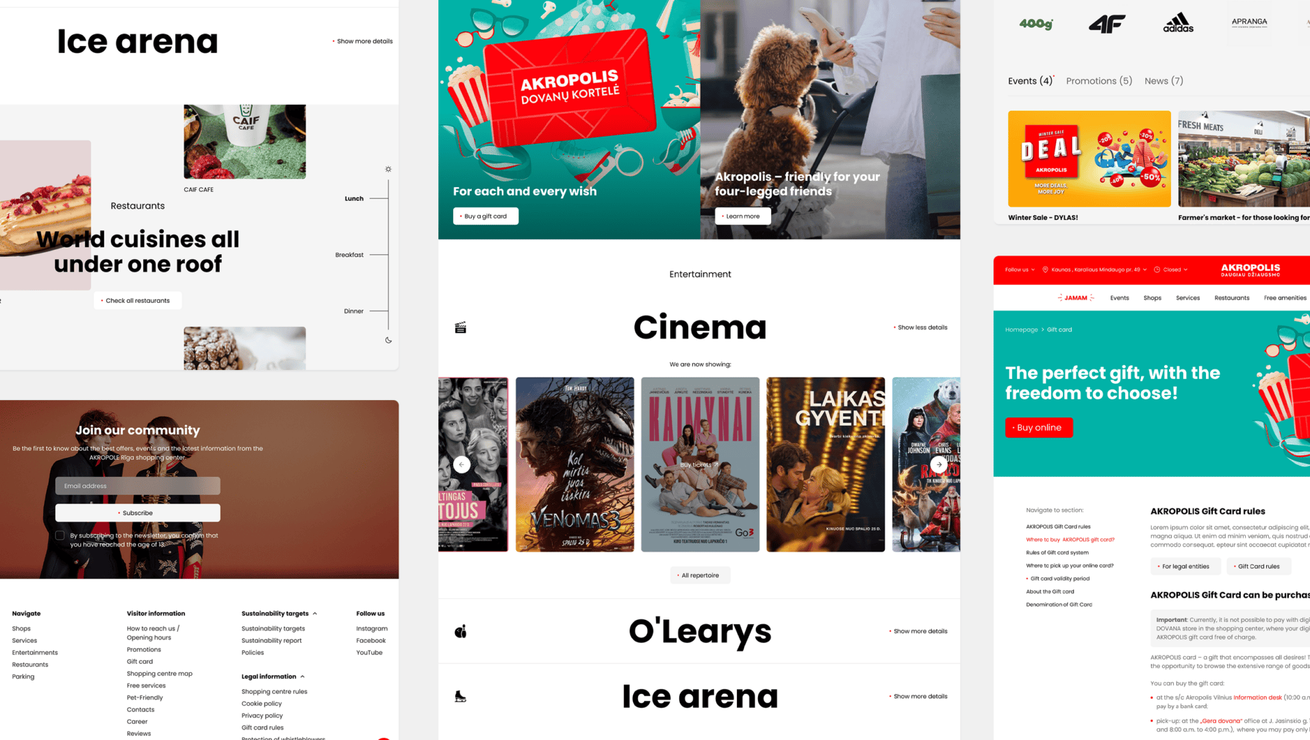
Akropolis needed a visual update that would feel modern today and still hold up years from now, built around one of the strongest brand colours in Baltic retail: Akropolis red.
Our Approach:
Civitta led the full redesign of the Akropolis website between January and November 2025, covering UX strategy, visual design and front-end development for both desktop and mobile.
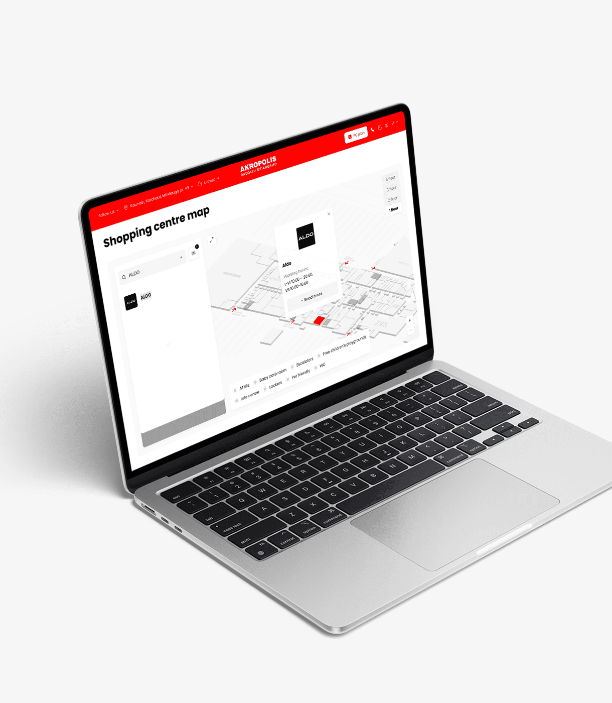
- SC Map: an interactive 3D centre map
We replaced the static floor plan with SC Map, an interactive 3D map of every Akropolis centre. Visitors can find any store, check its floor and get oriented before or during their visit. It also covers parking and surrounding streets, so navigation begins before they reach the door. SC Map was the most technically demanding part of the project. - Ergonomics first
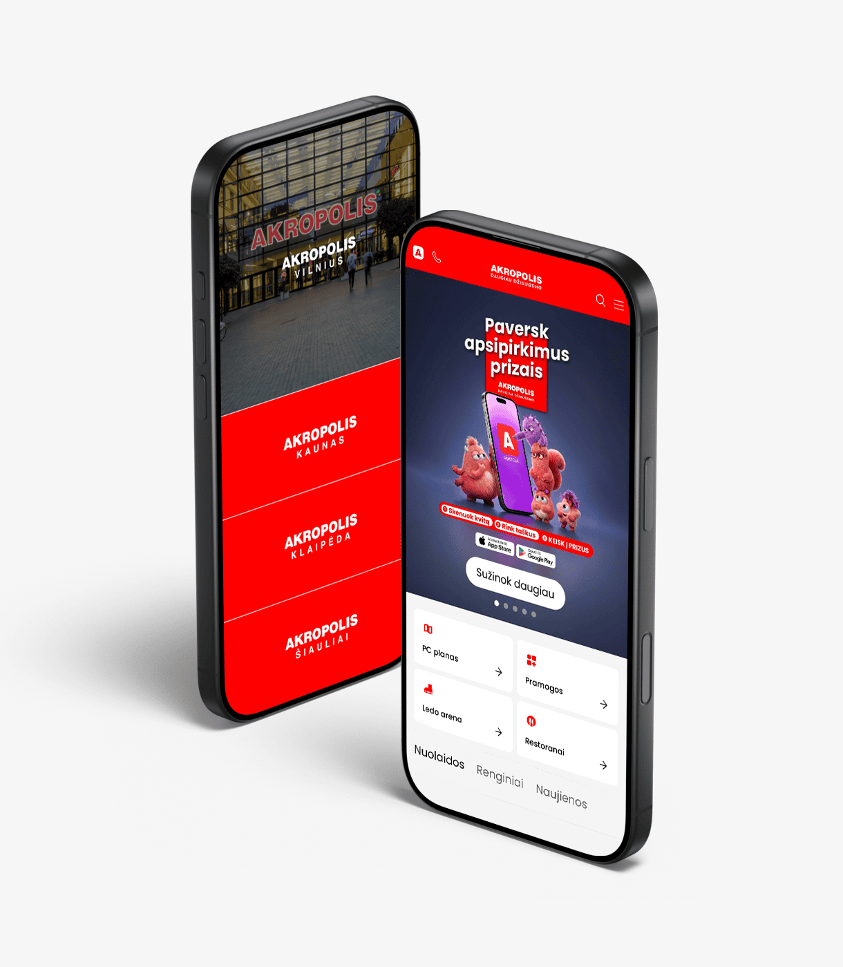
We rebuilt the site structure around the three things visitors use most: the centre map, current promotions and the store directory. Navigation is simpler, key actions are within one or two taps on mobile, and pages are organised so visitors find what they need without searching. - A modern, timeless design
Akropolis red is bold and instantly recognisable, but used too much it overwhelms a page. We built a calm, restrained visual system with generous white space and clean typography, and used red deliberately for emphasis and key actions. The brand stays unmistakable, and the design is built to last.
Results & Impact:
- The redesigned website launched in November 2025 across all Akropolis centres.
- SC Map is live for every centre, giving visitors a consistent, easier way to find their way around, online and on site.
- A simpler structure puts the map, promotions and stores one step from the homepage.
- Civitta continues to support Akropolis after launch, reviewing user sessions, identifying friction points and improving the site step by step.
Key Takeaways:
- For a shopping centre, the map is the product. Visitors come to the website to find their way around, so a good interactive map is the site’s most valuable feature, not a nice-to-have.
- Usefulness beats decoration. The biggest gains came from making the site easier to use, not from adding more content.
- A strong brand colour needs discipline. Timeless design comes from restraint: let the brand colour lead where it matters and give everything else room to breathe.